Wednesday, 23 December 2015

LO4: Budgeting

A) How much does a designer gets paid per hour?
I have done some research to try and find out the average price per hour of a freelance graphic designer.
(per 8-hour day)
Junior designer: £100
Midweight: £130
Senior: £250
Design director: £275


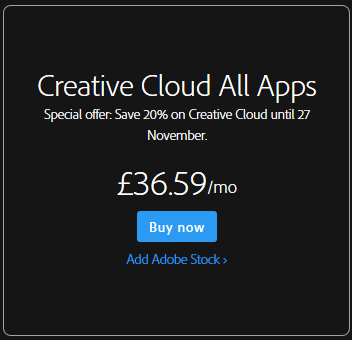
B) Price of software


C) Printing cost

http://www.spreadshirt.co.uk/design-your-own-t-shirt-C59 
This website allows me to buy t-shirts in bulk this means as this is part of the merchandise I would need to buy these items in bulk so this website would be good to buy from.
1 small T-shirt - £10.99
3,315 T-shirts is £10929.56 this means it would be £3.30 per T-shirt.
The average price for a festival T-shirt is £25 pound so this means that there would be 71,935.50 profit if all the T-shirts were sold. The T-shirts that are left over will be out on the website for people to buy after the show.

Sunday, 13 December 2015

LO3: Nick Baxx Feedback

I received feedback after presenting my work to Nick Baxx. I think my feedback was quite positive as he said that my conceptual ideas were good. The only negative feedback I received from Nick Baxx was that I didn't leave my work on the board long enough while presenting, this means I need to work on my presentation skills.

LO3: Peer Feedback


The feedback from my peers was mostly positive which is ood as it means that my work looks professional. The chart of the prefered logo shows me that "B" is the better logo, this means that I dont have to change my desgins on my other pieces. The feedback from my T-shirt is really good as most of my feedback tells me that this merchandise is something that people would buy as a music festival. The feedback of my ticket tells me that I have followed the conventions of a professional ticket however somebody said how it is quite difficult to read the information underneath the logo because the clash of colours. This means that I need to improve this aspect of the ticket, to do this I can expriment with hwo to make this writing easy to read.

Tuesday, 1 December 2015

LO2: Draft ticket


Colour
I have chosen blue for the background of the ticket as this is one of the colours that is a usual convention for a music festival

Logo
The logo text is quite basic which makes the ticket look too simple and unrecognisable. In my final ticket design I will need to import my final logo.

Layout
I like the layout of this ticket because it is presented in a way that you would see at a real music festival. In my final piece I am just going to tidy the corners up a bit to make it look smarter.

Font
The font I have used is quite simple and easy to read. This is something that I think is good to have in a ticket as over complicated font styles can sometimes be misread, which is not good when important information is on the ticket. However the text underneath the logo can be quite hard to read, To make this better I will need to make the writing more bold and also change the text colour to white to make it more visible from the background.

Comparison
In Comparison of my drawing of my draft design to my Photo-shopped design I have moved the sponsored Capital FM logo behind the text of the ticket and changed the opacity. I like this as it is almost like a watermark. In my Photo-shopped version I have also added more of a design to the ticket instead of just using lines to separate the text.


Monday, 30 November 2015

LO2: Draft T-shirt


Back
Front


These are the drafts of my T-shirt designs

Colour
I really like the colour of this T-shirt design as it matches the logo theme and the festival theme as a whole.

Logo
The logo text is quite basic which makes the T-Shirt look too simple. in my final t-shirt design I will need to import my final logo onto the T-Shirt.

Layout
I am going to slightly change the layout in my final design as some of the information on the back of the T-Shirt is slightly out of place and uneven so I will just tidy it up a bit to make it look more professional and appealing.

Artist Names
Instead of using the same font for every advertised artist on the back of the T-shirt I have used their own logos as this is usually how people instantly recognise an artist.

Comparison
In Comparison of my drawing of my draft design to my Photo-shopped design I have added the Dates of the festival on to the T-Shirts. For my final T-Shirt Design I am going to add the year of the festival on to the back of the T-Shirt as this is one of the main conventions of real festival T-shirt merchandise


Wednesday, 25 November 2015

LO2: Draft Poster

Colour
I have chosen blue for the background of the ticket as this is one of the colours that is a usual convention for a music festival

Logo
Again the logo text is quite basic which does make the festival very recognisable. In my final Poster design I will need to import my final logo.

Layout
I like the layout of this poster because it is presented in a way that you would see at a real music festival.

Font
The font I have used is quite simple and easy to read. This is something that I think is good to have in a poster as over complicated font styles can sometimes be misread, which is not good when important information is on the poster.

Comparison
My drawn draft design was really simple and not very detailed. This means my Photo-shopped design  was a big improvement from my first design as I have add many things such as the Dates of the festival, the location and the sponsored company. I have also added a background image of a crowd at a festival.