Monday, 30 November 2015

LO2: Draft T-shirt


Back
Front


These are the drafts of my T-shirt designs

Colour
I really like the colour of this T-shirt design as it matches the logo theme and the festival theme as a whole.

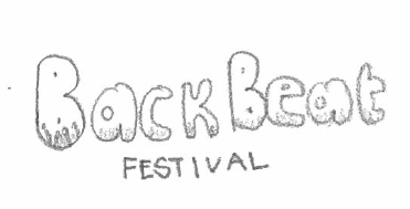
Logo
The logo text is quite basic which makes the T-Shirt look too simple. in my final t-shirt design I will need to import my final logo onto the T-Shirt.

Layout
I am going to slightly change the layout in my final design as some of the information on the back of the T-Shirt is slightly out of place and uneven so I will just tidy it up a bit to make it look more professional and appealing.

Artist Names
Instead of using the same font for every advertised artist on the back of the T-shirt I have used their own logos as this is usually how people instantly recognise an artist.

Comparison
In Comparison of my drawing of my draft design to my Photo-shopped design I have added the Dates of the festival on to the T-Shirts. For my final T-Shirt Design I am going to add the year of the festival on to the back of the T-Shirt as this is one of the main conventions of real festival T-shirt merchandise


Wednesday, 25 November 2015

LO2: Draft Poster

Colour
I have chosen blue for the background of the ticket as this is one of the colours that is a usual convention for a music festival

Logo
Again the logo text is quite basic which does make the festival very recognisable. In my final Poster design I will need to import my final logo.

Layout
I like the layout of this poster because it is presented in a way that you would see at a real music festival.

Font
The font I have used is quite simple and easy to read. This is something that I think is good to have in a poster as over complicated font styles can sometimes be misread, which is not good when important information is on the poster.

Comparison
My drawn draft design was really simple and not very detailed. This means my Photo-shopped design  was a big improvement from my first design as I have add many things such as the Dates of the festival, the location and the sponsored company. I have also added a background image of a crowd at a festival.


Monday, 23 November 2015

LO3: Logos


http://www.dafont.com/popcap.font

http://www.dafont.com/popsicle2.font?text=BACK+BEAT

http://www.dafont.com/blacklist.font?text=BACK+BEAT


http://www.dafont.com/war-is-over.font?text=BACK+BEAT

http://www.dafont.com/fragment-core.font?text=F+E+S+T+I+V+A+L&back=theme

http://www.dafont.com/typewriterhand.font?text=F+E+S+T+I+V+A+L&back=theme

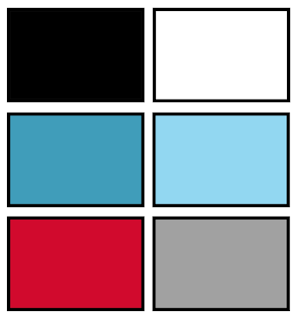
Poster Colour scheme ideas


The main colour that will be on my poster will be blue Black and white, this is because my logo will be black and white which means that the poster will look better if it has a colour theme, the background be hind the writing will be a blue as this festival will not be in summer so i will not be having very bright colours.