A) How much does a designer gets paid per hour?
I have done some research to try and find out the average price per hour of a freelance graphic designer.
(per 8-hour day)
Junior designer: £100
Midweight: £130
Senior: £250
Design director: £275
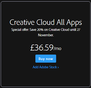
B) Price of software
C) Printing cost
http://www.spreadshirt.co.uk/design-your-own-t-shirt-C59
This website allows me to buy t-shirts in bulk this means as this is part of the merchandise I would need to buy these items in bulk so this website would be good to buy from.
1 small T-shirt - £10.99
3,315 T-shirts is £10929.56 this means it would be £3.30 per T-shirt.
The average price for a festival T-shirt is £25 pound so this means that there would be 71,935.50 profit if all the T-shirts were sold. The T-shirts that are left over will be out on the website for people to buy after the show.
Wednesday, 23 December 2015
Sunday, 13 December 2015
LO3: Nick Baxx Feedback
I received feedback after presenting my work to Nick Baxx. I think my
feedback was quite positive as he said that my conceptual ideas were
good. The only negative feedback I received from Nick Baxx was that I
didn't leave my work on the board long enough while presenting, this
means I need to work on my presentation skills.
LO3: Peer Feedback
The feedback from my peers was mostly positive which is ood as it means that my work looks professional. The chart of the prefered logo shows me that "B" is the better logo, this means that I dont have to change my desgins on my other pieces. The feedback from my T-shirt is really good as most of my feedback tells me that this merchandise is something that people would buy as a music festival. The feedback of my ticket tells me that I have followed the conventions of a professional ticket however somebody said how it is quite difficult to read the information underneath the logo because the clash of colours. This means that I need to improve this aspect of the ticket, to do this I can expriment with hwo to make this writing easy to read.
Saturday, 12 December 2015
Tuesday, 1 December 2015
LO2: Draft ticket

Colour
I have chosen blue for the background of the ticket as this is one of the colours that is a usual convention for a music festival
Logo
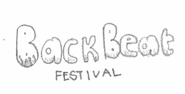
The logo text is quite basic which makes the ticket look too simple and unrecognisable. In my final ticket design I will need to import my final logo.
Layout
I like the layout of this ticket because it is presented in a way that you would see at a real music festival. In my final piece I am just going to tidy the corners up a bit to make it look smarter.
Font
The font I have used is quite simple and easy to read. This is something that I think is good to have in a ticket as over complicated font styles can sometimes be misread, which is not good when important information is on the ticket. However the text underneath the logo can be quite hard to read, To make this better I will need to make the writing more bold and also change the text colour to white to make it more visible from the background.
Comparison
In Comparison of my drawing of my draft design to my Photo-shopped design I have moved the sponsored Capital FM logo behind the text of the ticket and changed the opacity. I like this as it is almost like a watermark. In my Photo-shopped version I have also added more of a design to the ticket instead of just using lines to separate the text.
Monday, 30 November 2015
LO2: Draft T-shirt
 |
| Back |
 |
| Front |
These are the drafts of my T-shirt designs
Colour
I really like the colour of this T-shirt design as it matches the logo theme and the festival theme as a whole.
Logo
The logo text is quite basic which makes the T-Shirt look too simple. in my final t-shirt design I will need to import my final logo onto the T-Shirt.
Layout
I am going to slightly change the layout in my final design as some of the information on the back of the T-Shirt is slightly out of place and uneven so I will just tidy it up a bit to make it look more professional and appealing.
Artist Names
Instead of using the same font for every advertised artist on the back of the T-shirt I have used their own logos as this is usually how people instantly recognise an artist.
Comparison
In Comparison of my drawing of my draft design to my Photo-shopped design I have added the Dates of the festival on to the T-Shirts. For my final T-Shirt Design I am going to add the year of the festival on to the back of the T-Shirt as this is one of the main conventions of real festival T-shirt merchandise
Wednesday, 25 November 2015
LO2: Draft Poster
Colour
I have chosen blue for the background of the ticket as this is one of the colours that is a usual convention for a music festival
Logo
Again the logo text is quite basic which does make the festival very recognisable. In my final Poster design I will need to import my final logo.
Layout
I like the layout of this poster because it is presented in a way that you would see at a real music festival.
Font
The font I have used is quite simple and easy to read. This is something that I think is good to have in a poster as over complicated font styles can sometimes be misread, which is not good when important information is on the poster.
Comparison
My drawn draft design was really simple and not very detailed. This means my Photo-shopped design was a big improvement from my first design as I have add many things such as the Dates of the festival, the location and the sponsored company. I have also added a background image of a crowd at a festival.
Monday, 23 November 2015
LO3: Logos
http://www.dafont.com/popcap.font
http://www.dafont.com/popsicle2.font?text=BACK+BEAT
http://www.dafont.com/blacklist.font?text=BACK+BEAT
http://www.dafont.com/war-is-over.font?text=BACK+BEAT
http://www.dafont.com/fragment-core.font?text=F+E+S+T+I+V+A+L&back=theme
http://www.dafont.com/typewriterhand.font?text=F+E+S+T+I+V+A+L&back=theme
Poster Colour scheme ideas

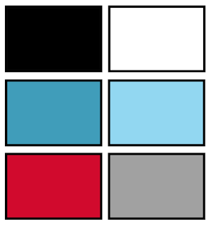
The main colour that will be on my poster will be blue Black and white, this is because my logo will be black and white which means that the poster will look better if it has a colour theme, the background be hind the writing will be a blue as this festival will not be in summer so i will not be having very bright colours.
Thursday, 12 November 2015
Friday, 11 September 2015
LO1: Keywords
White space: is just any extra space without text or images
semiotic terminology: is denotation and conation
Kering: the spacing between letters
House Style: Specific font and colour schemes
Serif: Is the fonts with flicks
Sans serif: Is the text without flicks. (Simple and clear)
Typography: Is a Font
Anchorage: Pinning down the meaning
semiotic terminology: is denotation and conation
Kering: the spacing between letters
House Style: Specific font and colour schemes
Serif: Is the fonts with flicks
Sans serif: Is the text without flicks. (Simple and clear)
Typography: Is a Font
Anchorage: Pinning down the meaning
Tuesday, 30 June 2015
LO1: Analysing Graphic Work: V Festival
Format
The
formats used is a form of advertisement as the festival is promoted on
popular items such as flyer's/posters, tickets, logos, merchandise and
more, this is so that more people will see these advertisements
Content, Style and Layout
Target audience
The
target audience for this festival is round 12 to 30 years
old this is because the festival advertises artists that will appeal to
a wide range of audiences. The gender is for both genders as it
contains all different bands and singers which suit both males and
females. ABC1 would
be 90% as you would have to be working class to afford this even as it
is an extremely expensive event that would only be suitable to people
that have enough disposable income.
Regulatory bodies
ASA
is Advertising Standards Authority is a self-regulatory organisation of
the advertising industry in the UK. This poster is appropriate to use
for all ages as it doesnt contain any graphic imags, drugs or alchohol
even though you can still buy these thing at the festival.Monday, 29 June 2015
LO1: Analysing Graphic Work: Itunes Festival
Format
The
formats used is a form of advertisement as the festival is promoted on
popular items such as flyer's/posters, tickets, logos, merchandise and
more, this is so that more people will see these advertisements
The
target audience for this festival are people who are enjoy chart music.
These are people who are usually around 13 to 30 years old. The gender
is for both genders as it contains all different bands and singers
which suit both males and females. ABC1 would be 90% as this is a free
festival as the only way to get in is to win a ticket which can be
applied by online which means that the audience will need access to
internet.
Regulatory bodies
ASA
is Advertising Standards Authority is a self-regulatory organisation of
the advertising industry in the UK. This poster is appropriate to use
for all ages as it doesnt contain any graphic imags, drugs or alchohol
even though you can still buy these thing at the festival.LO1: Analysing Graphic Work: Sun Down Festival
 |
| Logo |
Purpose
The
purpose of this poster is to advertise and promote a music festival in
the UK to invite Students and young adults to go to the festival.
Format
The
formats used is a form of advertisement as the festival is promoted on
popular items such as flyer's/posters, tickets, logos, merchandise and
more, this is so that more people will see these advertisements
 |
| Poster |
Target audience
The
target audience for this festival is round 16 to 30 years old this is
because the festival advertises artists that will appeal to both
students and young adults. This is also the target age as the show is
obviously late at night as it is called sundown. The target gender for
this festival is for both genders as it contains all different bands and
singers which suit both males and females. ABC1 would be 90% as you
would have to be working class to afford this even as it is an extremely
expensive event that would only be suitable to people that have enough
disposable income.
Regulatory bodies
ASA
is Advertising Standards Authority is a self-regulatory organisation of
the advertising industry in the UK. This poster is appropriate to use
for all ages as it doesnt contain any graphic imags, drugs or alchohol
even though you can still buy these thing at the festival.
LO1: Analysing Graphic Work: T in the park
Purpose
The
purpose of this poster is to advertise and promote a music festival in
the UK to invite Students and young adults to go to the festival.
Format
The
formats used is a form of advertisement as the festival is promoted on
popular items such as flyer's/posters, tickets, logos, merchandise and
more, this is so that more people will see these advertisements

Target audience
The
target audience for this festival is round 16 to 30 years old this is
because the festival advertises artists that will appeal to both
students and young adults. This is also the target age as the show is
obviously late at night as it is called sundown. The target gender for
this festival is for both genders as it contains all different bands and
singers which suit both males and females. ABC1 would be 90% as you
would have to be working class to afford this even as it is an extremely
expensive event that would only be suitable to people that have enough
disposable income.
Regulatory bodies
ASA
is Advertising Standards Authority is a self-regulatory organisation of
the advertising industry in the UK. This poster is appropriate to use
for all ages as it doesnt contain any graphic imags, drugs or alchohol
even though you can still buy these thing at the festival.LO1: Analysing Graphic Work: Fusion Festival
Purpose
The purpose of this poster is to advertise and promote one of the biggest music festival in the UK to invite Students and young adults to go to the festival.
Format
The
formats used is a form of advertisement as the festival is promoted on
popular items such as flyer's/posters, tickets, logos, merchandise and
more, this is so that more people will see these advertisements
Content, Style and Layout
Target audience
The
target audience for this festival is round 12 to 30 years old this is
because the festival advertises artists that will appeal to a wide range
of audiences. The gender is for both genders as it contains all
different bands and singers which suit both males and females. ABC1
would be 90% as you would have to be working class to afford this even
as it is an extremely expensive event that would only be suitable to
people that have enough disposable income.
Regulatory bodies
ASA
is Advertising Standards Authority is a self-regulatory organisation of
the advertising industry in the UK. This poster is appropriate to use
for all ages as it doesnt contain any graphic imags, drugs or alchohol
even though you can still buy these thing at the festival.Wednesday, 24 June 2015
LO2: Task 2: Mindmap
Subscribe to:
Posts (Atom)


